ShopDreamUp AI ArtDreamUp
Deviation Actions


Suggested Deviants


Suggested Collections


You Might Like…


Featured in Groups


Description
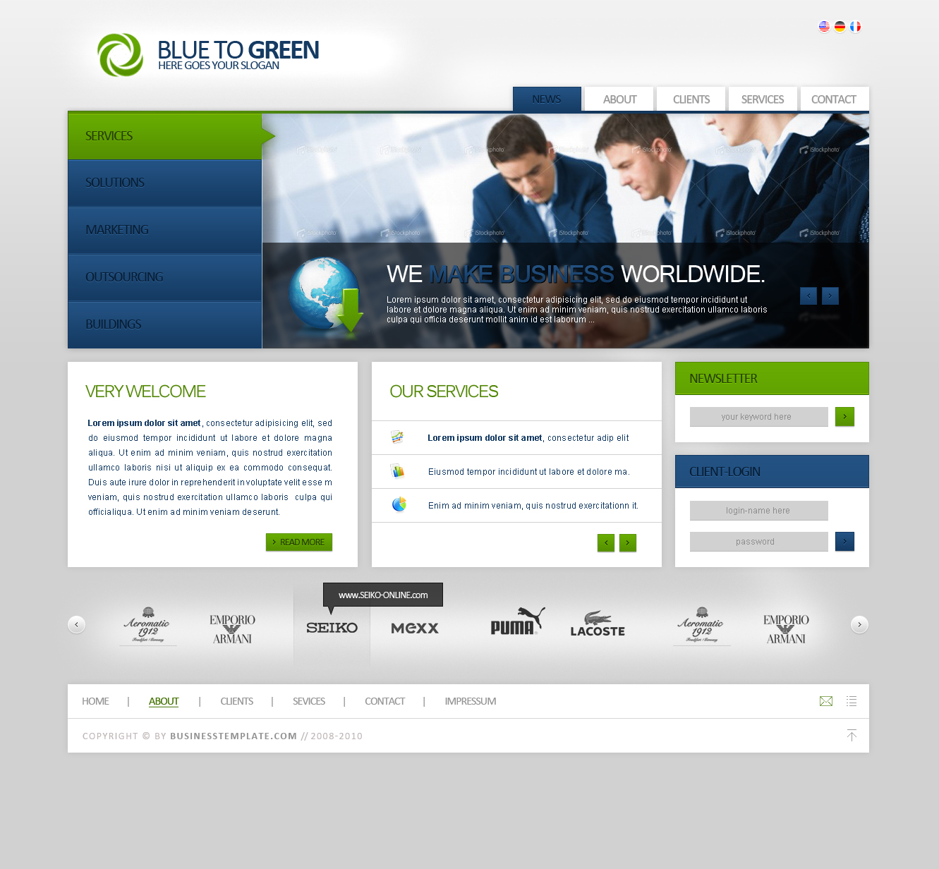
logotype: *Torsten85
status: for sale
v. 1 - browserview: [link]
v. 2 - browserview: [link]
-------------------------------------------------------------
credits: www.istockphoto.com
comments andare very welcome and appreciated!!
-------------------------------------------------------------
Please respect the copyrights.
www.modernwebconcepts.com
copyright Torsten Kühnreich, Germany
Gallery | ModernWebConcepts | Facebook | DesignersCouch | FAQ


Image size
1331x1232px 632.01 KB
© 2009 - 2024 Torsten85
Comments55
Join the community to add your comment. Already a deviant? Log In
This design has a lot of promise in it. It's very clean and professional, using hard edges to accentuate the block organization of content. The color scheme is very appealing. Although blue and green aren't very aggressive colors, they can easily become such when overused in a design. Here, you've balanced the amount of color with the amount of white space, giving the piece a very pleasing aesthetic to it.
On the same subject of color, I feel as though using dark tones as the font color on the blue and green elements may not have been the best choice. This isn't always a bad practice, but ideally, for this to work, you'd want to have lighter tones of blue and green to provide contrast with the darker text. In this case, your blue and green gradients are fairly dark, so the text begins to blend more than stand out. A solution to this would be to use a lighter tone of blue/green for that text, or, even better, just use white.
Another place this becomes a problem is the header image. The shaded background and blue on the businessman's coat make the blue text blend more than pop out. Green or white would work here, but the green would allow you to have more detail since the text is stylized.
The only other suggestion I could think of is to add something of contrast to the background. The clean cut look of the content boxes is slick, but adding a bit of excitement to the background could make the experience as a whole more enjoyable.
All in all I really enjoy this design, and, aside from these few suggestions, I think you've done a great job here.